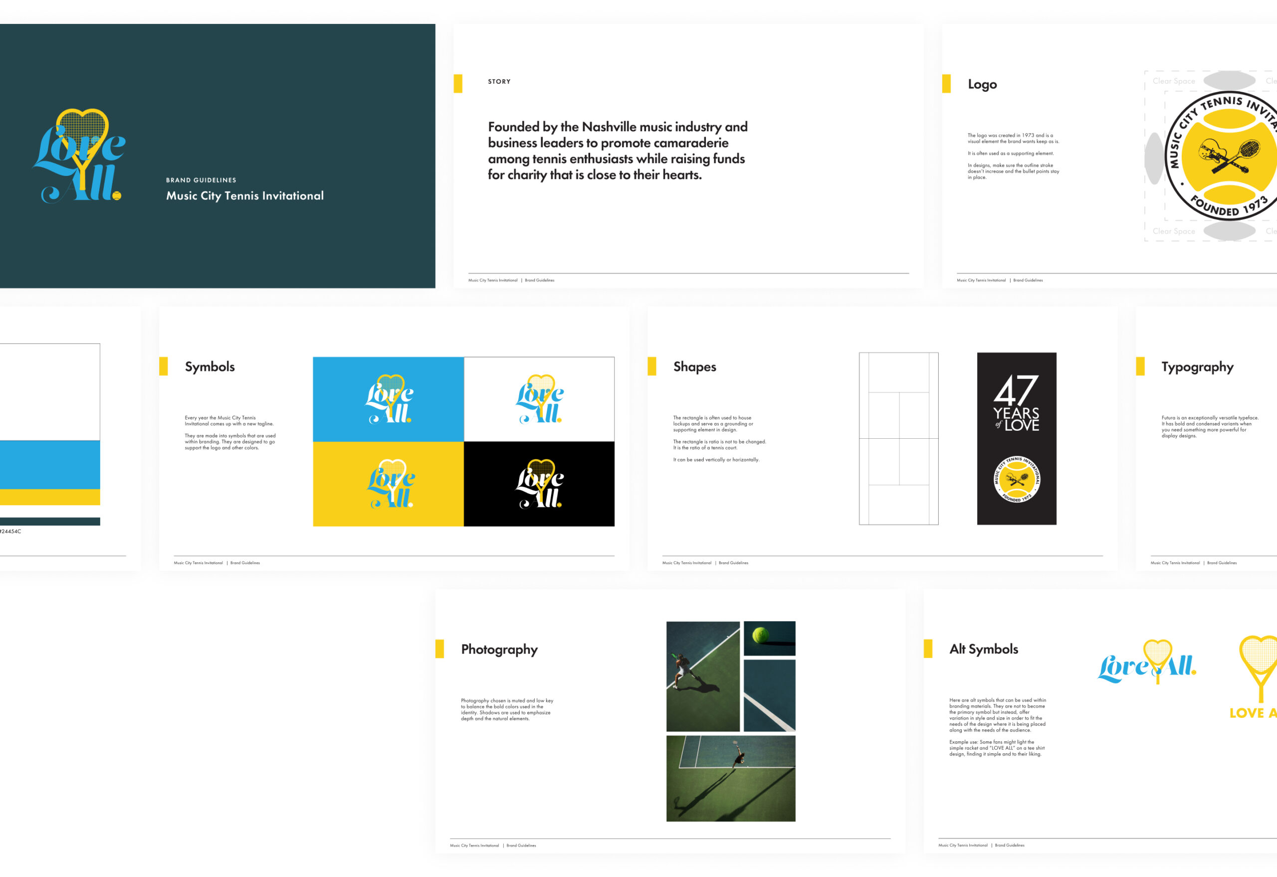
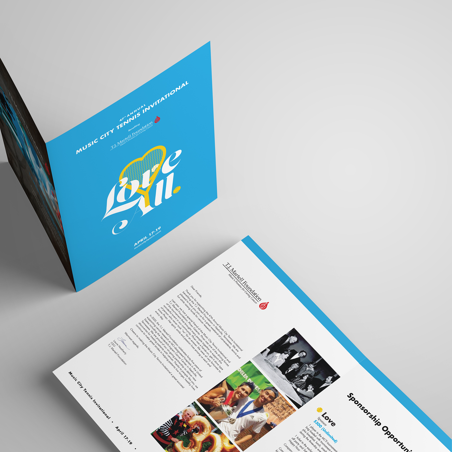
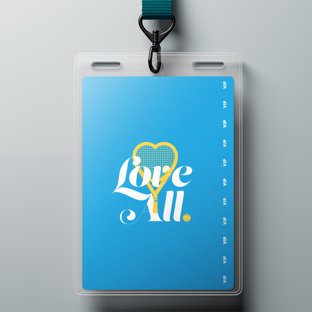
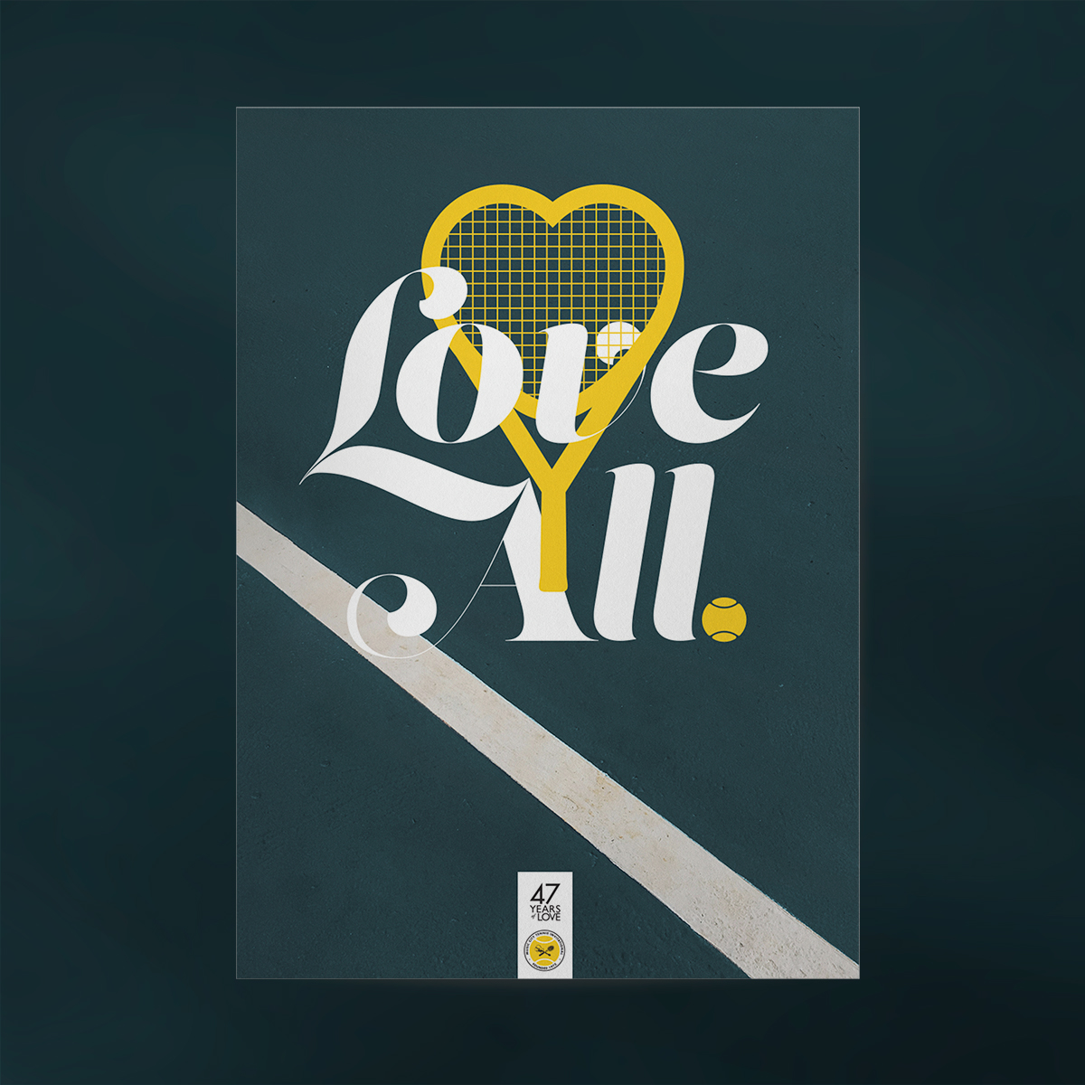
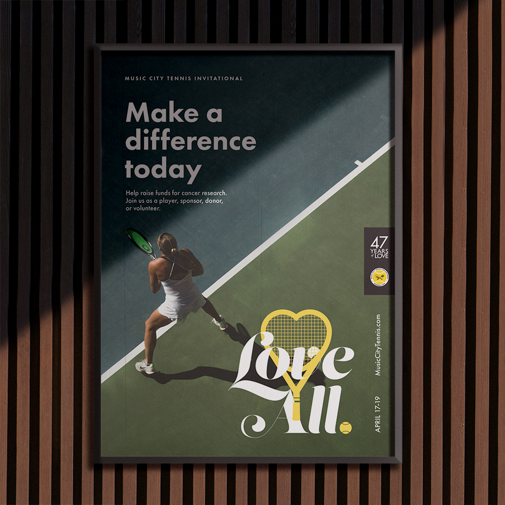
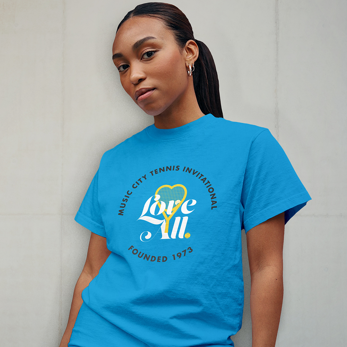
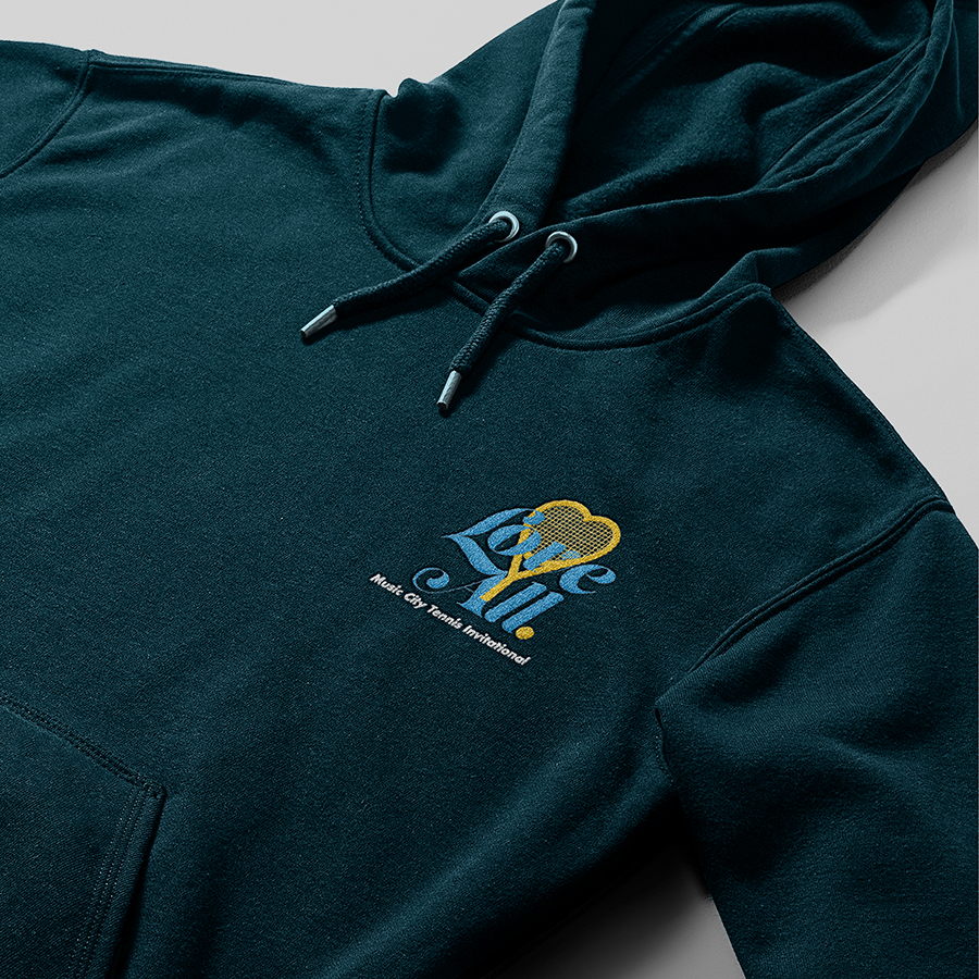
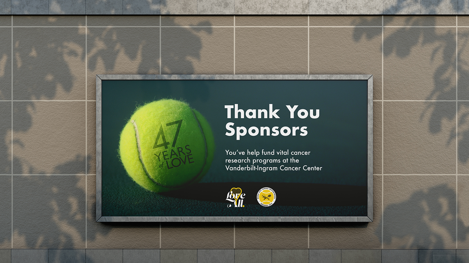
The Music City Tennis Invitational raises awareness for the T.J. Martell mission while increasing attendance and donations for cancer research. Shannon refreshed the event branding with a new tagline, social media visuals, and merchandise while preserving the original MCTI logo, a fixture since 1973. The visual identity update introduced a more dynamic color palette, new anniversary graphics, refined typography, and an expanded photography library, blending archival and stock imagery to honor the tournament’s history.